Finding Root Causes of Changes in a Supply Chain#
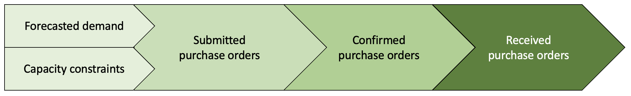
In a supply chain, the number of units of each product in the inventory that is available for shipment is crucial to fulfill customers’ demand faster. For this reason, retailers continuously buy products anticipating customers’ demand in the future.
Suppose that each week a retailer submits purchase orders (POs) to vendors taking into account future demands for products and capacity constraints to consider for demands. The vendors will then confirm whether they can fulfill some or all of the retailer’s purchase orders. Once confirmed by the vendors and agreed by the retailer, products are then sent to the retailer. All of the confirmed POs, however, may not arrive at once.
Week-over-week changes#
For this case study, we consider synthetic data inspired from a real-world use case in supply chain. Let us look at data over two weeks, w1 and w2 in particular.
[1]:
import pandas as pd

data = pd.read_csv('supply_chain_week_over_week.csv')
[2]:
from IPython.display import HTML

data_week1 = data[data.week == 'w1']

HTML(data_week1.head().to_html(index=False)+'<br/>')
[2]:
| asin | demand | constraint | submitted | confirmed | received | week |
|---|---|---|---|---|---|---|
| C33384370E | 5.0 | 2.0 | 5.0 | 5.0 | 5.0 | w1 |
| F48C534AEF | 1.0 | 0.0 | 2.0 | 2.0 | 2.0 | w1 |
| 6DF2CA5FB8 | 4.0 | 2.0 | 2.0 | 2.0 | 2.0 | w1 |
| 1D1C2500DB | 2.0 | 1.0 | 2.0 | 2.0 | 2.0 | w1 |
| 0A83B415E2 | 0.0 | 1.0 | -0.0 | -0.0 | -0.0 | w1 |
[3]:
data_week2 = data[data.week=='w2']

HTML(data_week2.head().to_html(index=False)+'<br/>')
[3]:
| asin | demand | constraint | submitted | confirmed | received | week |
|---|---|---|---|---|---|---|
| C33384370E | 3.0 | 1.0 | 3.0 | 7.0 | 7.0 | w2 |
| F48C534AEF | 3.0 | 2.0 | 1.0 | 3.0 | 3.0 | w2 |
| 6DF2CA5FB8 | 5.0 | 1.0 | 6.0 | 12.0 | 12.0 | w2 |
| 1D1C2500DB | 3.0 | 3.0 | 0.0 | 1.0 | 1.0 | w2 |
| 0A83B415E2 | 3.0 | 1.0 | 2.0 | 5.0 | 5.0 | w2 |
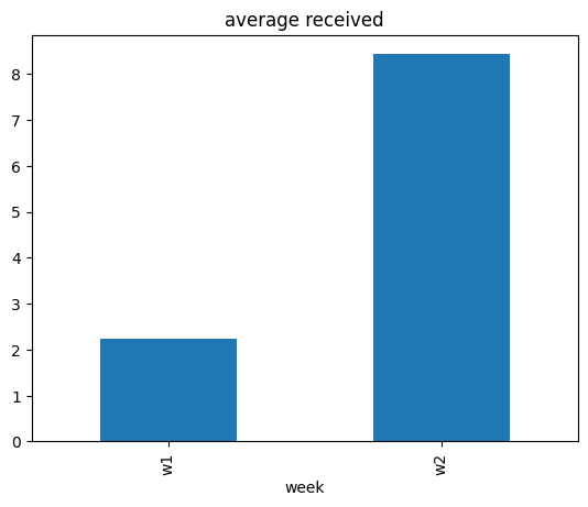
Our target of interest is the average value of received over those two weeks.
[4]:
data.groupby(['week']).mean(numeric_only=True)[['received']].plot(kind='bar', title='average received', legend=False);
[5]:
data_week2.received.mean() - data_week1.received.mean()
[5]:
np.float64(6.197)
The average value of received quantity has increased from week w1 to week w2. Why?
Why did the average value of received quantity change week-over-week?#
Ad-hoc attribution analysis#
To answer the question, one option is to look at the average value of other variables week-over-week, and see if there are any associations.
[6]:
data.groupby(['week']).mean(numeric_only=True).plot(kind='bar', title='average', legend=True);
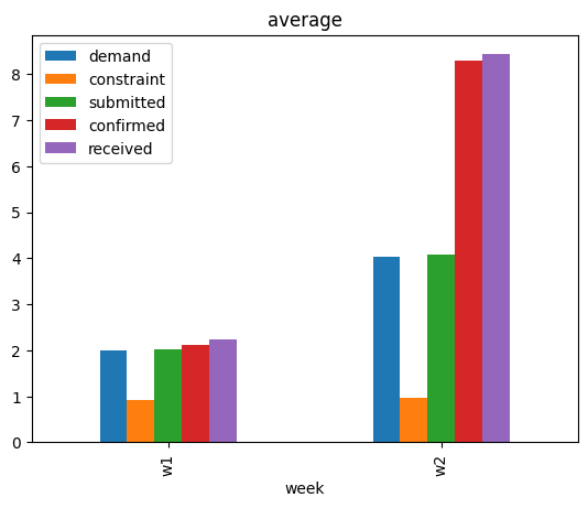
We see that the average values of other variables, except constraint, have also increased. While this suggests that some event(s) that changed the average values of other variables could possibly have changed the average value of received, that on itself is not a satisfactory answer. One may also use domain knowledge here to claim that change in the average value of demand could be the main driver, after all demand is a key variable. We will see later that such conclusions can miss other important factors. For a rather systematic answer, we turn to attribution analysis based on causality.
Causal Attribution Analysis#
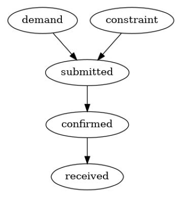
We consider the distribution-change-attribution method based on graphical causal models described in Budhathoki et al., 2021, which is also implmented in DoWhy. In summary, given the underlying causal graph of variables, the attribution method attributes the change in the marginal distribution of a target variable (or its summary, such as its mean) to changes in data-generating processes (also called “causal mechanisms”) of variables upstream in the causal graph. A causal mechanism of a variable is the conditional distribution of the variable given its direct causes. We can also think of a causal mechanism as an algorithm (or a compute program) in the system that takes the values of direct causes as input and produces the value of the effect as an output. To use the attribution method, we first require the causal graph of the variables, namely demand, constraint, submitted, confirmed and received.
Graphical causal model#
We build the causal graph using domain knowledge. Based on the description of supply chain in the introduction, it is plausible to assume the following causal graph.
[7]:
import dowhy
dowhy.enable_notebook_rendering()

import networkx as nx
import dowhy.gcm as gcm
from dowhy.utils import plot
gcm.util.general.set_random_seed(0)

causal_graph = nx.DiGraph([('demand', 'submitted'),
                           ('constraint', 'submitted'),
                           ('submitted', 'confirmed'),
                           ('confirmed', 'received')])
plot(causal_graph)
Now, we can setup the causal model:
[8]:
import matplotlib.pyplot as plt
import numpy as np

# disabling progress bar to not clutter the output here
gcm.config.disable_progress_bars()

# setting random seed for reproducibility
np.random.seed(10)

causal_model = gcm.StructuralCausalModel(causal_graph)

# Automatically assign appropriate causal models to each node in graph
auto_assignment_summary = gcm.auto.assign_causal_mechanisms(causal_model, data_week1)
Before we attributing the changes to the nodes, let’s first take a look at the result of the auto assignment:
[9]:
print(auto_assignment_summary)
When using this auto assignment function, the given data is used to automatically assign a causal mechanism to each node. Note that causal mechanisms can also be customized and assigned manually.
The following types of causal mechanisms are considered for the automatic selection:

If root node:
An empirical distribution, i.e., the distribution is represented by randomly sampling from the provided data. This provides a flexible and non-parametric way to model the marginal distribution and is valid for all types of data modalities.

If non-root node and the data is continuous:
Additive Noise Models (ANM) of the form X_i = f(PA_i) + N_i, where PA_i are the parents of X_i and the unobserved noise N_i is assumed to be independent of PA_i.To select the best model for f, different regression models are evaluated and the model with the smallest mean squared error is selected.Note that minimizing the mean squared error here is equivalent to selecting the best choice of an ANM.

If non-root node and the data is discrete:
Discrete Additive Noise Models have almost the same definition as non-discrete ANMs, but come with an additional constraint for f to only return discrete values.
Note that 'discrete' here refers to numerical values with an order. If the data is categorical, consider representing them as strings to ensure proper model selection.

If non-root node and the data is categorical:
A functional causal model based on a classifier, i.e., X_i = f(PA_i, N_i).
Here, N_i follows a uniform distribution on [0, 1] and is used to randomly sample a class (category) using the conditional probability distribution produced by a classification model. Here, different model classes are evaluated using the log loss metric and the best performing model class is selected.

In total, 5 nodes were analyzed:

--- Node: demand
Node demand is a root node. Therefore, assigning 'Empirical Distribution' to the node representing the marginal distribution.

--- Node: constraint
Node constraint is a root node. Therefore, assigning 'Empirical Distribution' to the node representing the marginal distribution.

--- Node: submitted
Node submitted is a non-root node with discrete data. Assigning 'Discrete AdditiveNoiseModel using Pipeline' to the node.
This represents the discrete causal relationship as submitted := f(constraint,demand) + N.
For the model selection, the following models were evaluated on the mean squared error (MSE) metric:
Pipeline(steps=[('polynomialfeatures', PolynomialFeatures(include_bias=False)),
                ('linearregression', LinearRegression)]): 1.1828666304115492
LinearRegression: 1.202146528455657
HistGradientBoostingRegressor: 1.3214374799939141

--- Node: confirmed
Node confirmed is a non-root node with discrete data. Assigning 'Discrete AdditiveNoiseModel using LinearRegression' to the node.
This represents the discrete causal relationship as confirmed := f(submitted) + N.
For the model selection, the following models were evaluated on the mean squared error (MSE) metric:
LinearRegression: 0.10631247993087496
Pipeline(steps=[('polynomialfeatures', PolynomialFeatures(include_bias=False)),
                ('linearregression', LinearRegression)]): 0.10632506989501964
HistGradientBoostingRegressor: 0.22146133208979166

--- Node: received
Node received is a non-root node with discrete data. Assigning 'Discrete AdditiveNoiseModel using LinearRegression' to the node.
This represents the discrete causal relationship as received := f(confirmed) + N.
For the model selection, the following models were evaluated on the mean squared error (MSE) metric:
LinearRegression: 0.1785978818963511
Pipeline(steps=[('polynomialfeatures', PolynomialFeatures(include_bias=False)),
                ('linearregression', LinearRegression)]): 0.17920013806550833
HistGradientBoostingRegressor: 0.2892923434164462

===Note===
Note, based on the selected auto assignment quality, the set of evaluated models changes.
For more insights toward the quality of the fitted graphical causal model, consider using the evaluate_causal_model function after fitting the causal mechanisms.
It seems most of the relationship can be well captured using a linear model. Let’s further evaluate the assumed graph structure.
[10]:
gcm.falsify.falsify_graph(causal_graph, data_week1, n_permutations=20, plot_histogram=True)
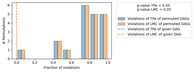
[10]:
+-------------------------------------------------------------------------------------------------------+
|                                         Falsification Summary                                         |
+-------------------------------------------------------------------------------------------------------+
| The given DAG is informative because 1 / 20 of the permutations lie in the Markov                     |
| equivalence class of the given DAG (p-value: 0.05).                                                   |
| The given DAG violates 0/7 LMCs and is better than 95.0% of the permuted DAGs (p-value: 0.05).        |
| Based on the provided significance level (0.05) and because the DAG is informative,                   |
| we do not reject the DAG.                                                                             |
+-------------------------------------------------------------------------------------------------------+
Since we do not reject the DAG, we consider our causal graph structure to be confirmed.
Attributing change#
We can now attribute the week-over-week change in the average value of received quantity:
[11]:
# call the API for attributing change in the average value of `received`
contributions = gcm.distribution_change(causal_model,
                                        data_week1,
                                        data_week2,
                                        'received',
                                        num_samples=2000,
                                        difference_estimation_func=lambda x1, x2 : np.mean(x2) - np.mean(x1))
[12]:
from dowhy.utils import bar_plot
bar_plot(contributions, ylabel='Contribution')
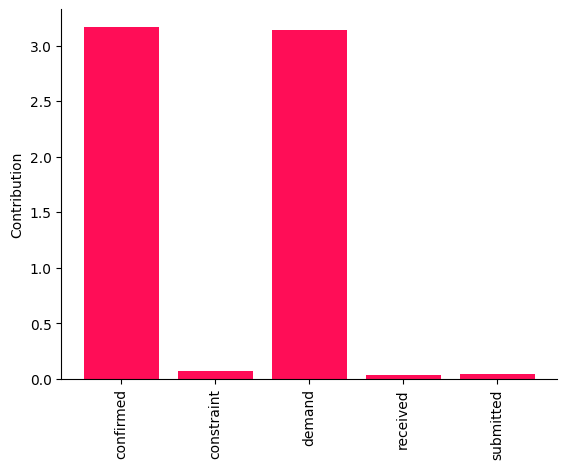
These point estimates suggest that changes in the causal mechanisms of demand and confirmed are the main drivers of the change in the average value of received between two weeks. It would be risky, however, to draw conclusions from these point estimates. Therefore, we compute the bootstrap confidence interval for each attribution.
[13]:
median_contribs, uncertainty_contribs = gcm.confidence_intervals(
    gcm.bootstrap_sampling(gcm.distribution_change,
                           causal_model,
                           data_week1,
                           data_week2,
                           'received',
                           num_samples=2000,
                           difference_estimation_func=lambda x1, x2 : np.mean(x2) - np.mean(x1)),
    confidence_level=0.95,
    num_bootstrap_resamples=5,
    n_jobs=-1)
Evaluating set functions...: 100%|██████████| 32/32 [00:00<00:00, 203.46it/s]
Evaluating set functions...: 100%|██████████| 32/32 [00:00<00:00, 182.91it/s]
Evaluating set functions...: 100%|██████████| 32/32 [00:00<00:00, 155.46it/s]
Evaluating set functions...: 100%|██████████| 32/32 [00:00<00:00, 173.37it/s]
Evaluating set functions...: 100%|██████████| 32/32 [00:00<00:00, 283.07it/s]
[14]:
bar_plot(median_contribs, ylabel='Contribution', uncertainties=uncertainty_contribs)
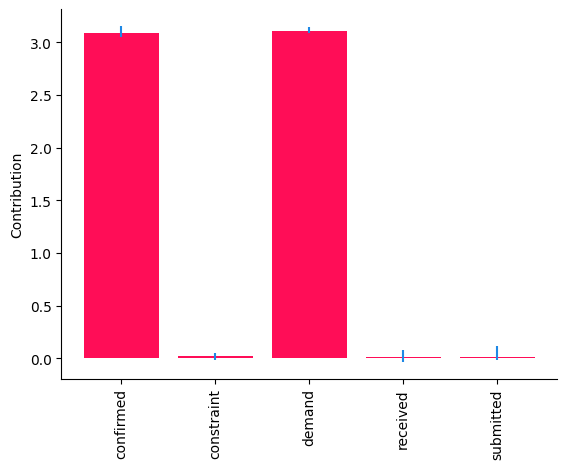
Whereas the \(95\%\) confidence intervals for the contributions of demand and confirmed are above \(0\), those of other nodes are close to \(0\). Overall, these results suggest that changes in the causal mechanisms of demand and confirmed are the drivers for the observed change in the received quantity week-over-week. Causal mechanisms can change in a real-world system, for instance, after deploying a new subsystem with a different algorithm. In fact, these results are consistent with the ground truth (see Appendix).
Appendix: Ground Truth#
We generate synthetic data inspired from a real-world use case in Amazon’s supply chain. To this end, we assume a linear Additive Noise Model (ANM) as the underlying data-generating process at each node. That is, each node is a linear function of its direct causes and an additive unobserved noise term. For more technical details on ANMs, we refer the interested reader to Chapter 7.1.2 of Elements of Causal Inference book. Using linear ANMs, we generate data (or draw i.i.d. samples) from the distribution of each variable. We use the Gamma distribution for noise terms mainly to mimic real-world setting, where the distribution of variables often show heavy-tail behaviour. Between two weeks, we only change the data-generating process (causal mechanism) of demand and confirmed respectively by changing the value of demand mean from \(2\) to \(4\), and linear coefficient \(\alpha\) from \(1\) to \(2\).
[15]:
import pandas as pd
import secrets

ASINS = [secrets.token_hex(5).upper() for i in range(1000)]
import numpy as np
def buying_data(alpha, beta, demand_mean):
    constraint = np.random.gamma(1, scale=1, size=1000)
    demand = np.random.gamma(demand_mean, scale=1, size=1000)
    submitted = demand - constraint + np.random.gamma(1, scale=1, size=1000)
    confirmed = alpha * submitted + np.random.gamma(0.1, scale=1, size=1000)
    received = beta * confirmed + np.random.gamma(0.1, scale=1, size=1000)
    return pd.DataFrame(dict(asin=ASINS,
                              demand=np.round(demand),
                              constraint=np.round(constraint),
                              submitted = np.round(submitted),
                              confirmed = np.round(confirmed),
                              received = np.round(received)))


# we change the parameters alpha and demand_mean between weeks
data_week1 = buying_data(1, 1, demand_mean=2)
data_week1['week'] = 'w1'
data_week2 = buying_data(2, 1, demand_mean=4)
data_week2['week'] = 'w2'

data = pd.concat([data_week1, data_week2], ignore_index=True)
# write data to a csv file
# data.to_csv('supply_chain_week_over_week.csv', index=False)